Don’t Get Fooled by Figures (Part II)
This article was written by Matthew J. Kuhn, DVM, PhD.
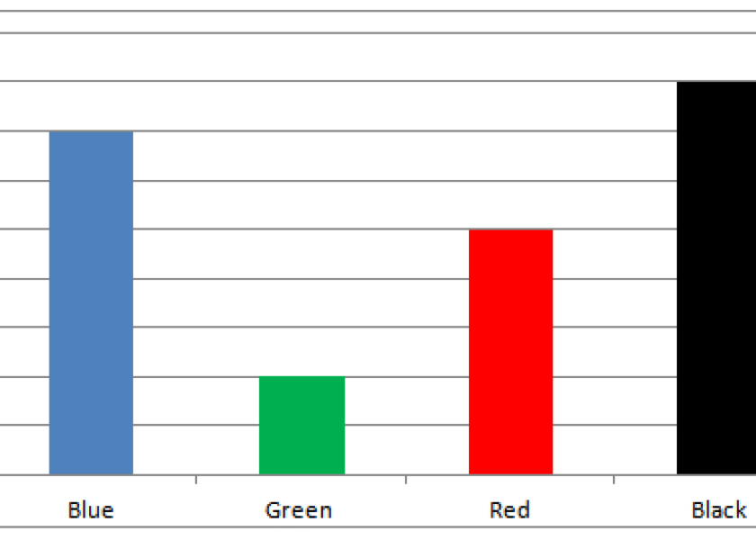
In part I of this article (Don’t Get Fooled by Figures (Part I)) bar graphs with differing presentation styles were juxtaposed to highlight how changes in style can alter a reader’s interpretation of a graph. Here in part II, similar design choices are applied to figures that compare two datasets.
Comparing Datasets Fairly
When dot plots are used to represent correlations or graphs contain a right Y-axis (vertical axis), additional considerations should be taken to interpret the data. Both correlations and the use of a right Y-axis unquestionably have practical and appropriate uses when presenting data, yet they only tell part of a story and without context can easily overstate conclusions.
Correlations
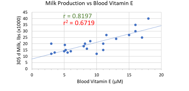
When presenting the relationship between two datasets, for example 305-day milk production and vitamin E in the blood, a correlation may be used to represent this relationship numerically. Correlations are commonly listed as ‘r’ and as a decimal between -1 and 1 (such as r = 0.82), where values further from 0 in either direction represent a stronger relationship. Be aware of correlations presented as ‘r2’ or ‘R2’, however, which represent the coefficient of determination, used statistically to explain how much of an effect is due to a certain cause. Take the square root this value for the correlation (r value).
One common question regarding correlations is “what is a good correlation coefficient (r)?” The difficulty in appropriately answering this question highlights one of the primary reasons correlations can mislead – no single rule applies to all correlations. Although those familiar with data analysis will use general rules to think about correlations, such rules are dependent on study design and cannot necessarily be applied broadly.
In the graphic example of Milk Production and Blood Vitamin E, it may be easy to think that increasing vitamin E may result in increased milk production. But what if we compared these variables to feed intake? Cows that eat more are more likely to produce more milk and have greater concentrations of vitamin E in their blood. In this example, the correlation between production and blood vitamin E is created by their true cause-effect relationship with feed intake, a confounding variable.
To avoid unnecessarily associating datasets, think critically about what factors not shown could contribute to a potential relationship between the variables.
 Right Y-axis
Graphs that present a Y-axis on both the left and right typically aim to compare two different forms of data. Similar to correlations, overlaying two datasets that trend together intuitively suggests a relationship. Because each axis can have different units and range of values, these graph types can easily influence how data is interpreted.
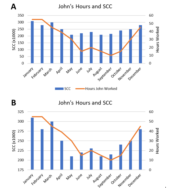
An example of how axis manipulation can influence the reader is clear when comparing graphs John's Hours and SCC A and B, where the left axis on Graph B is manipulated. Changing the axes can cause datasets to appear more closely associated. Graphs using these techniques can be especially convincing and confusing when the Y-axis do not start at zero or it is unclear which axis datasets apply to, as is also the case with graph B.
In the example, John spends certain times of the year engaged in the crop side of the farm’s operations, lending fewer hours to the dairy. Whereas graph A does not elicit an initial thought of an obvious relationship, graph B steers the eye towards a relationship between the hours John has worked and the somatic cell count (SCC) of the cows. This suggests that as he spends more time on the dairy cows develop a higher SCC.
Before speaking with John about his potential negative impact on animal health, consider other factors (confounding variables) underlying this relationship. Stall cleanliness may differ in the winter or the parlor may be cleaned less frequently as gets colder, both of which could influence the herd SCC.
 Correlations and the use of a right Y-axis are important tools for data visualization when used responsibly. Unfortunately, their ability to effectively present important relationships in data can unintentionally present readers with fictional relationships as well.
As with all graphs, be critical of the data you are presented; be mindful of axis scale and units; and be considerate of the variables that could be confounding the data you are presented.