Don’t Get Fooled by Figures (Part I)
This article was written by Matthew J. Kuhn, DVM, PhD.
When was the last day you went without seeing a graph? On the news, evaluating farm data, reading a marketing pitch – exposure to graphical data subliminally influences our decisions on a daily basis. Yet, how often do you take the time to think critically and ask what a graph is actually saying? With abundant supplements, pharmaceuticals, and other products marketed to producers and veterinarians daily, it is crucial to quickly identify the good data from the bad.
Why Graphs Can Be Misleading
Graphs created to intentionally mislead are uncommon. Instead, misleading graphs typically result from scientists whose pride in their work clouds following proper graph etiquette or from creative designers seeking to increase the visual appeal of their work. As such, these red flags are not necessarily indicators of poor data quality but can key a reader in to focus more carefully on what the data is or is not saying; encourage the reader to ask more questions of the data source; or seek out second opinions.
The red flags discussed in depth below include:
• 3-D Graphs
• Y-axis (vertical axis) manipulation
• Missing error bars, statistics, axes labels, or units
• Control group absence
• Lack of practical relevance
Red Flags
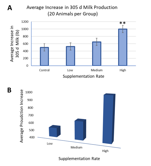
Completely fictional yet identical data underlies graphs A and B. A difference in their dimension strikes most readers first, appreciating the 2-D graph A as less visually appealing than the 3-D graph B. Marketing teams and creative designers look to 3-D graphs as a means to increase the attractiveness of their work. Adding depth at an angle, however, distorts the perception of relative differences, which is apparent when comparing the difference in height between the Low and Medium groups.
Manipulation of the Y-axis further contributes to the stark difference in interpretations of graphs A and B. Depending on how an axis is altered, data can be powerfully framed to either overstate or understate differences. In graph A, a proper Y-axis for this data begins at zero and extend to just above the greatest value. Graph B uses a truncated Y-axis, starting well above zero and provides an example of Y-axis manipulation, namely, exaggeration of the differences between all three bars.
The omission of error bars in graph B is an additional fault in presentation. In graph A, the error bars clearly overlap between the Low and Medium groups showing that although the average values differ there is a wide overlap in the production of individual cows between these groups. This overlap leaves little statistical chance that Medium and Low groups truly differ, a fact that is unapparent in graph B.
Using error bars to make statistical judgements, however, is bound by caveats. Without knowing what error bars represent — standard error (smallest error bars), standard deviation (somewhat larger error bars), or minimum/maximum values (largest error bars) — comparing error bars offers a statistical guess rather than a certainty. Additionally, certain statistical tests will produce significant differences even when error bars overlap, such as when animals are matched prior to comparison. Because of this, unless details on statistical analysis are available, error bars should help inform decision-making but are not a definitive statistical resource.
Whenever a control group is excluded, readers should always ask themselves if that omission aligns with the study design. The graphical juxtaposition between graphs A and B again underscores the importance of including a control group. Graph A shows that regardless of treatment, this farm had an increase in 305 day milk and that likely there was no statistical increase over control by the Low or Medium groups. If readers had only seen graph B, they may have believed even the Low group benefited from this product.
A final question to ask of all data is “do the differences I see actually matter?” Key in on Y-axis labels to inform your answer. The ambiguity of graph B, both in the data being shown and units, prevents a reader from answering this question. Graph A, however, indicates that the High group gains a 500 lb increase in 305 day milk. While this difference may be statistically significant, it may not be an impressive or relevant increase in production to a producer.
Good research is defendable and will stand up to critique. Taking a respectfully distrustful eye to presented data will go a long way to making more informed and successful decisions for yourself and your clients.